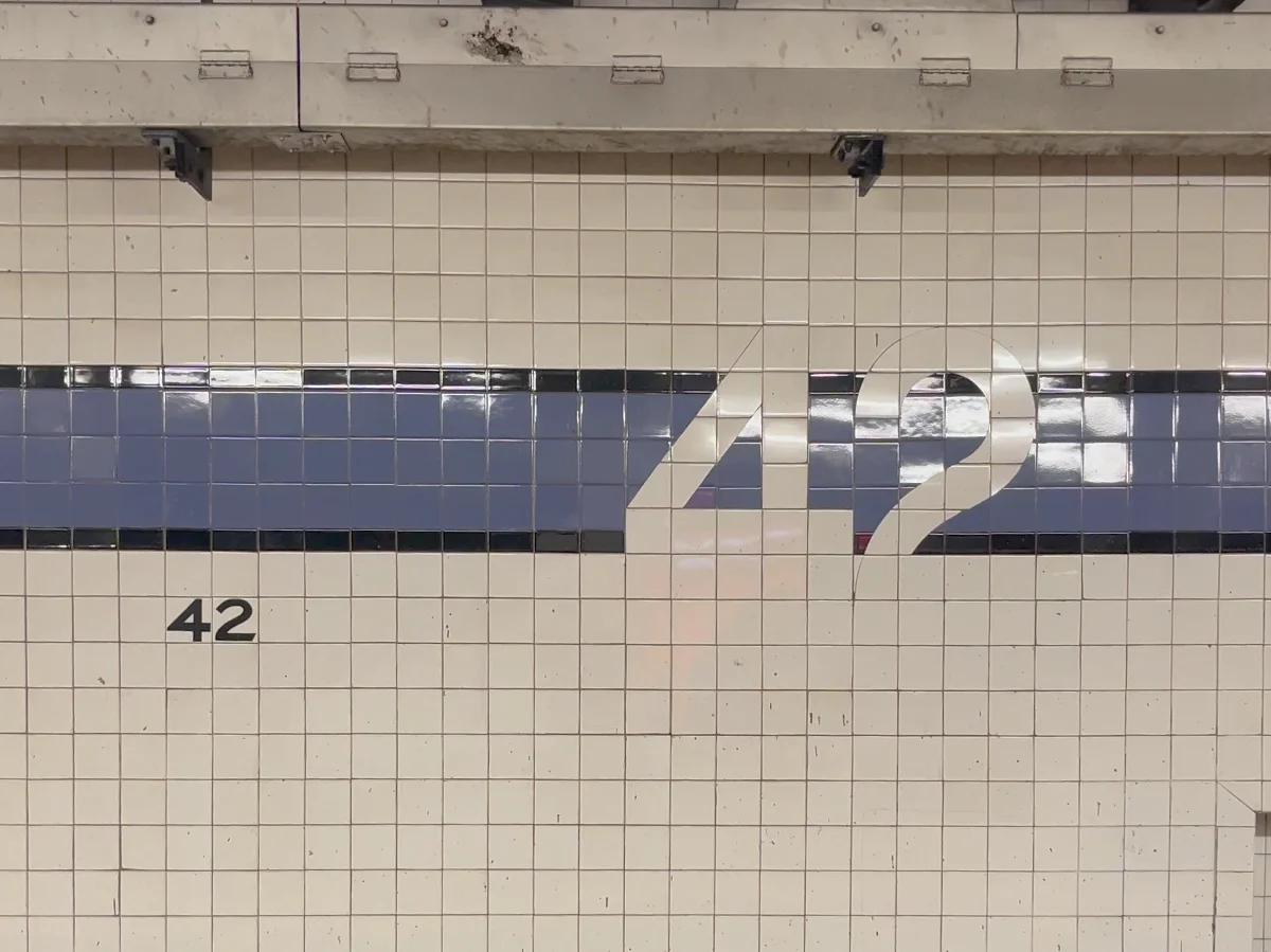
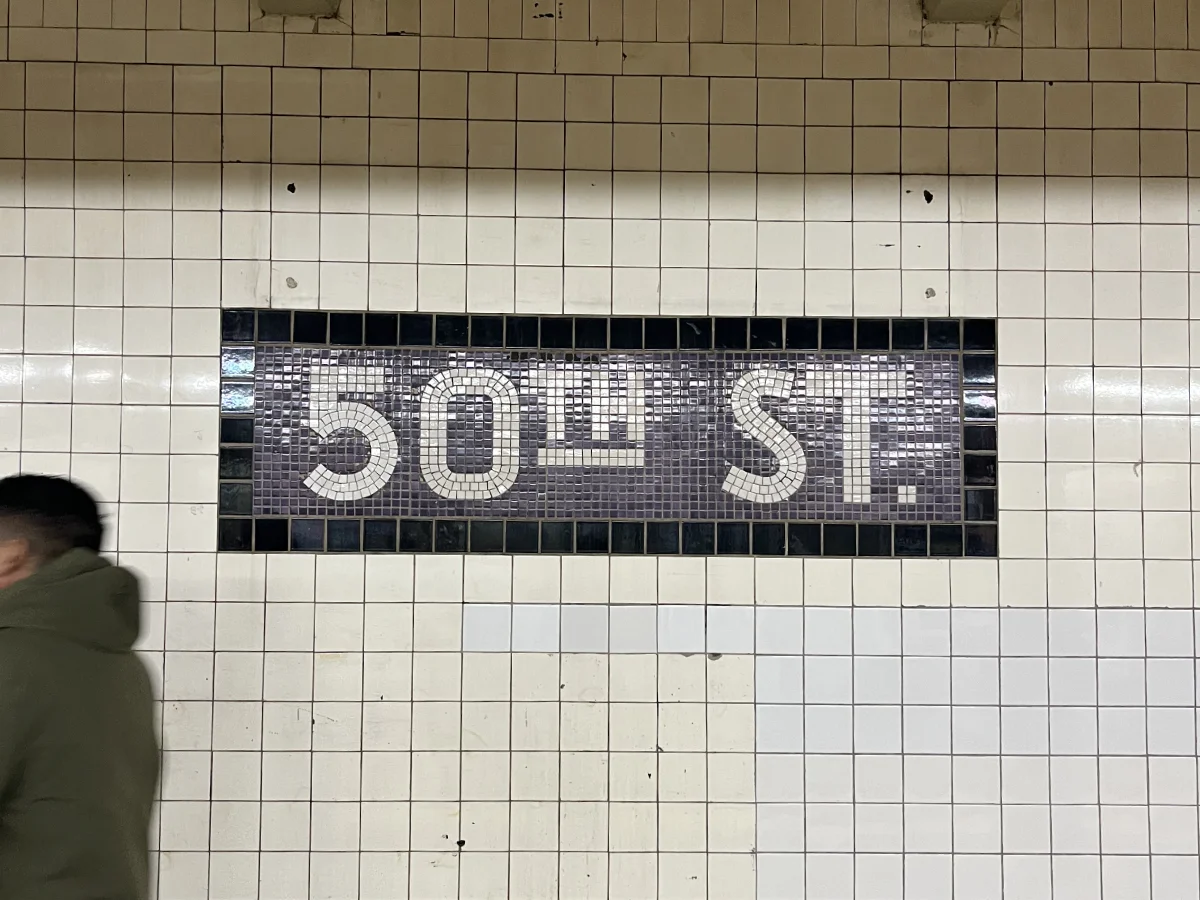
This is a New York City subway mosaic, and its color has a hidden meaning.
To understand it, you have to know that New York’s subway did not start as one system. Before 1940, it was three: the IRT, the BMT, and the city-run IND, the Independent Subway System.
When the IND was built in the 1930s, for what are now the A, C, E, F, and G lines, its chief architect embedded a clever design rule into the stations.
Local stations along a line shared a single tile color until you reached an express stop. At that express station, the color changed. Then the local stations after it adopted that new color, until the next express stop reset it again.
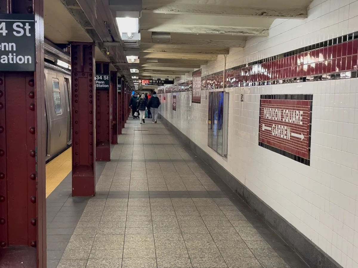
Express stations were emphasized further, with matching columns and bold color bands wrapping the space.
But why color instead of signage? The exact reason is not well documented, but historians think it may have helped riders navigate intuitively, especially in a city of many languages.
The three systems finally merged in 1940, with standardized signage arriving by the 1970s. Instead of color-coding stations the way the IND did in the 1930s, the system adopted the colors we recognize today, grouping lines that share tracks below 60th Street in Manhattan.
So seen through today’s lens, the IND tile colors can seem confusing or even unhelpful. But the subway is not static, neither figuratively nor literally. It is a system that has been redesigned and reinterpreted over time.
The next time you see those tiles, look closer. This is infrastructure meant to be understood without words.