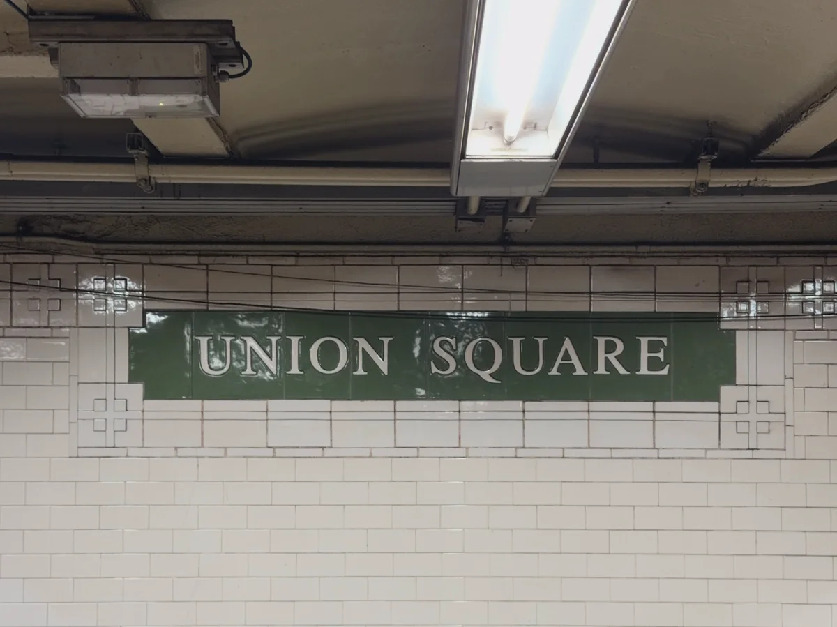
This font is one of the only things that’s consistent across all 472 subway stations.
The subway was originally 3 distinct systems, and even within those systems stations were built, and rebuilt, at very different times. This meant the individual train lines had their own naming conventions. Each station had its own relatively unique signage helping people get around. And even within a single station, the signage could be a hodgepodge of styles depending on what was in vogue when it was renovated.
In 1940, the city unified these 3 systems into the single system we have today. But even though the systems were unified on paper, the reality was very different.
As the 40s and 50s progressed, free transfers between the old IRT, BMT, and IND stations were introduced. Navigating between these different systems was now a confusing mess of different signs, names, and conventions, however.
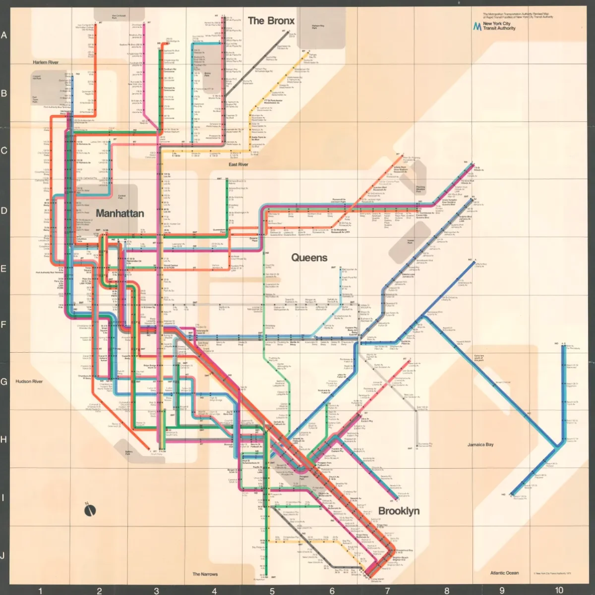
So, in the 60s and 70s, the subway made its first attempts at creating some design standards. These standards took a number of different forms. This was the era that birthed the idea of lettered and numbered trains. For the first time, train lines received their now distinctive color coding—designed to loosely align with what tracks the train traveled on in Midtown and below. The MTA commissioned its first map from a formal design firm: the so-called Vignelli Map, which New Yorkers famously hated at the time and which the MTA abandoned. The impact of these design choices had a long life. You need only look at the latest subway map the MTA released in 2025 to see echoes of Vignelli.
Finally, this era also saw the first real attempt at creating a standard font and signage system.
The font they chose was, perhaps understandably, named Standard (or Akzidenz Grotesk outside of the US). This was a modern, legible, sans-serif typeface.
But the rollout wasn’t without issues. For one, the J in Standard wasn’t hooky enough. This is especially problematic for a system with an entire J line. By contrast, Helvetica, a derivative of Standard, already more popular at the time, solved this problem.
Legend has it that original designers preferred Helvetica anyway, but they simply didn’t have the metal type on hand.
So, over time, Helvetica grew to replace Standard as the standard font. And in 1989, this replacement was made official.
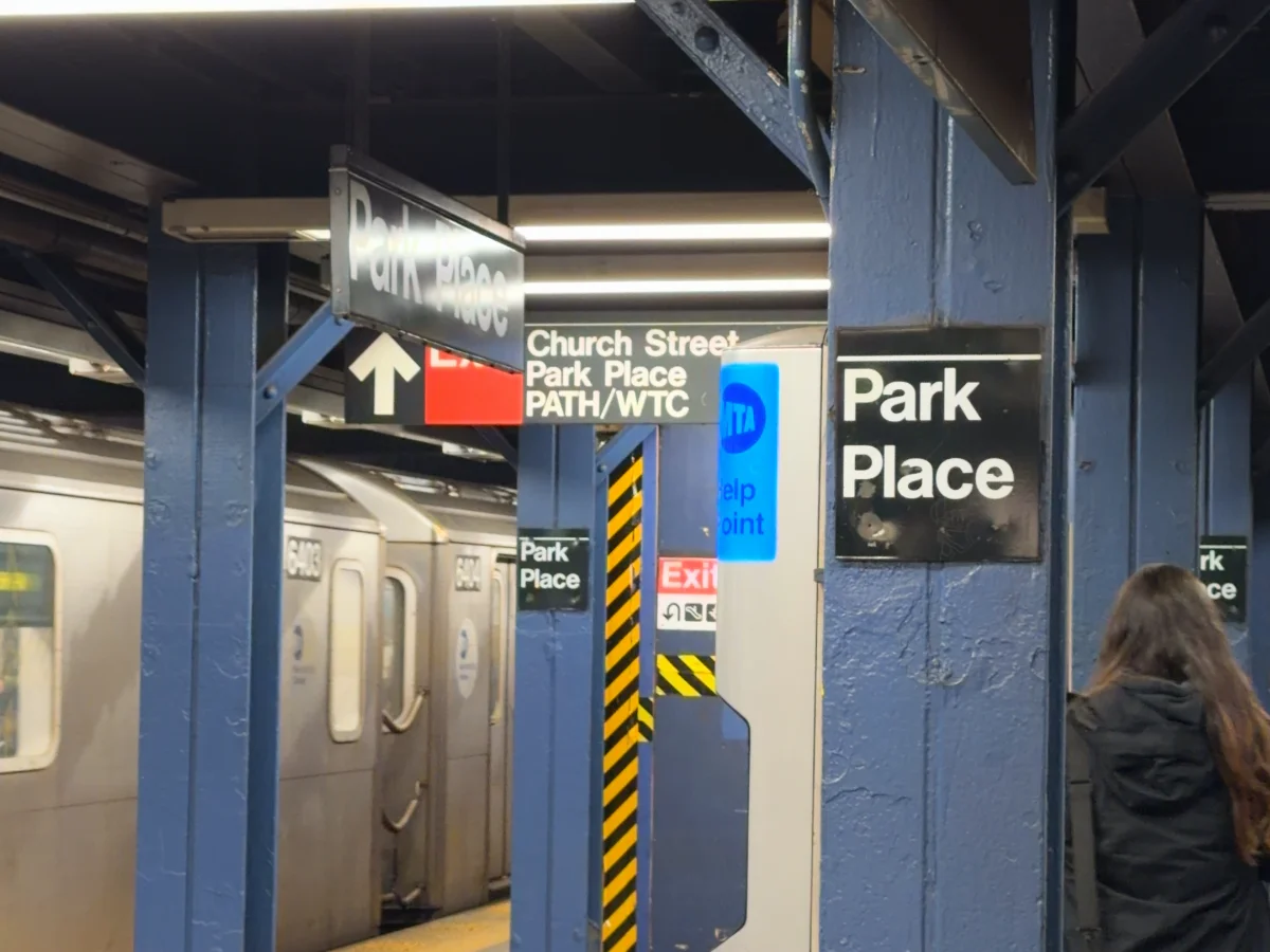
Today, as you navigate NYC’s subway, even though you’ll see a wide array of station styles and designs, you can always look to the consistent black-and-white signs to find your way.
Helped along by the subway’s official font: Helvetica.
So what do you think? Was Helvetica the right choice? Are there other things the subway should be doing today to help give a more standardized experience?